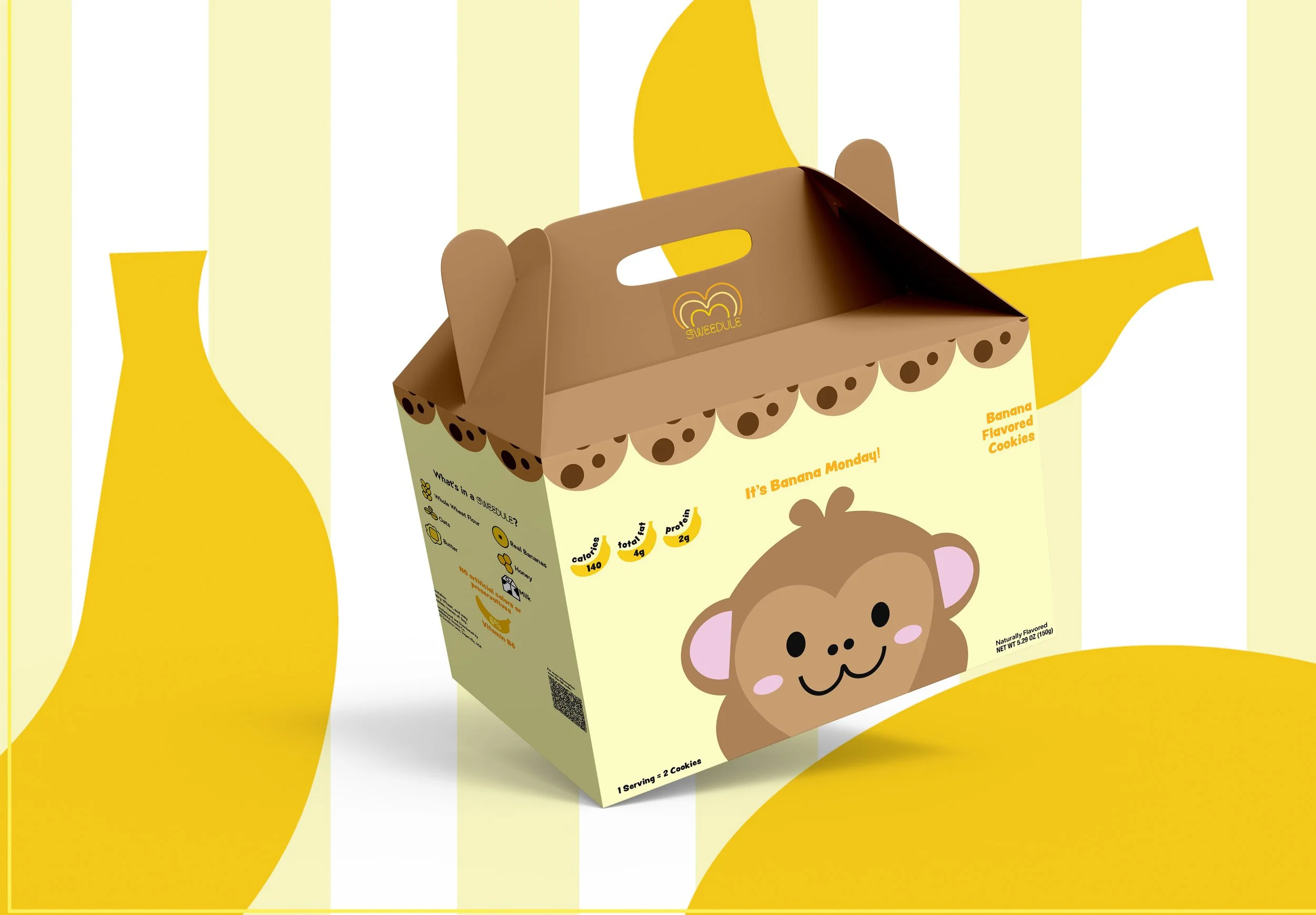
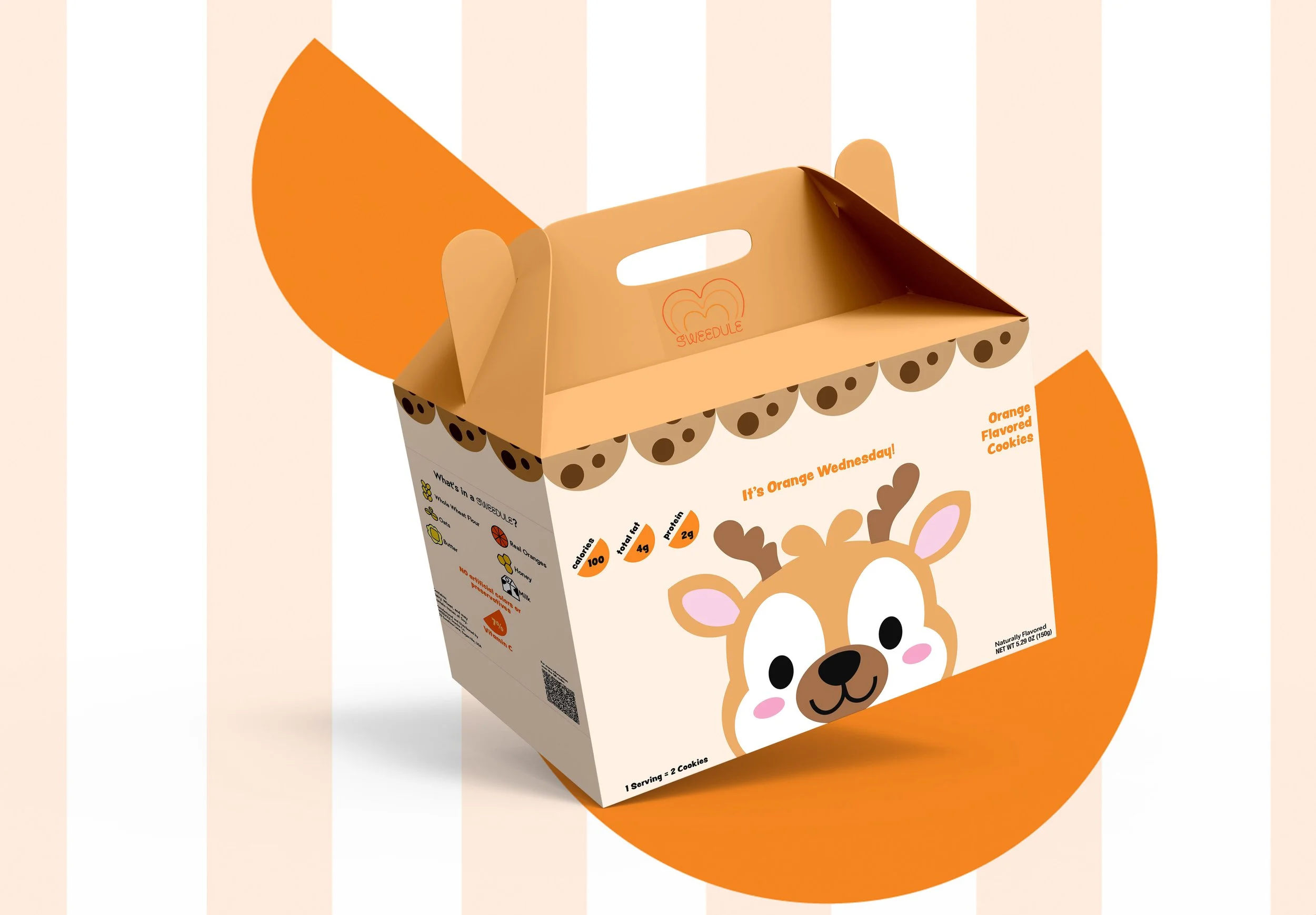
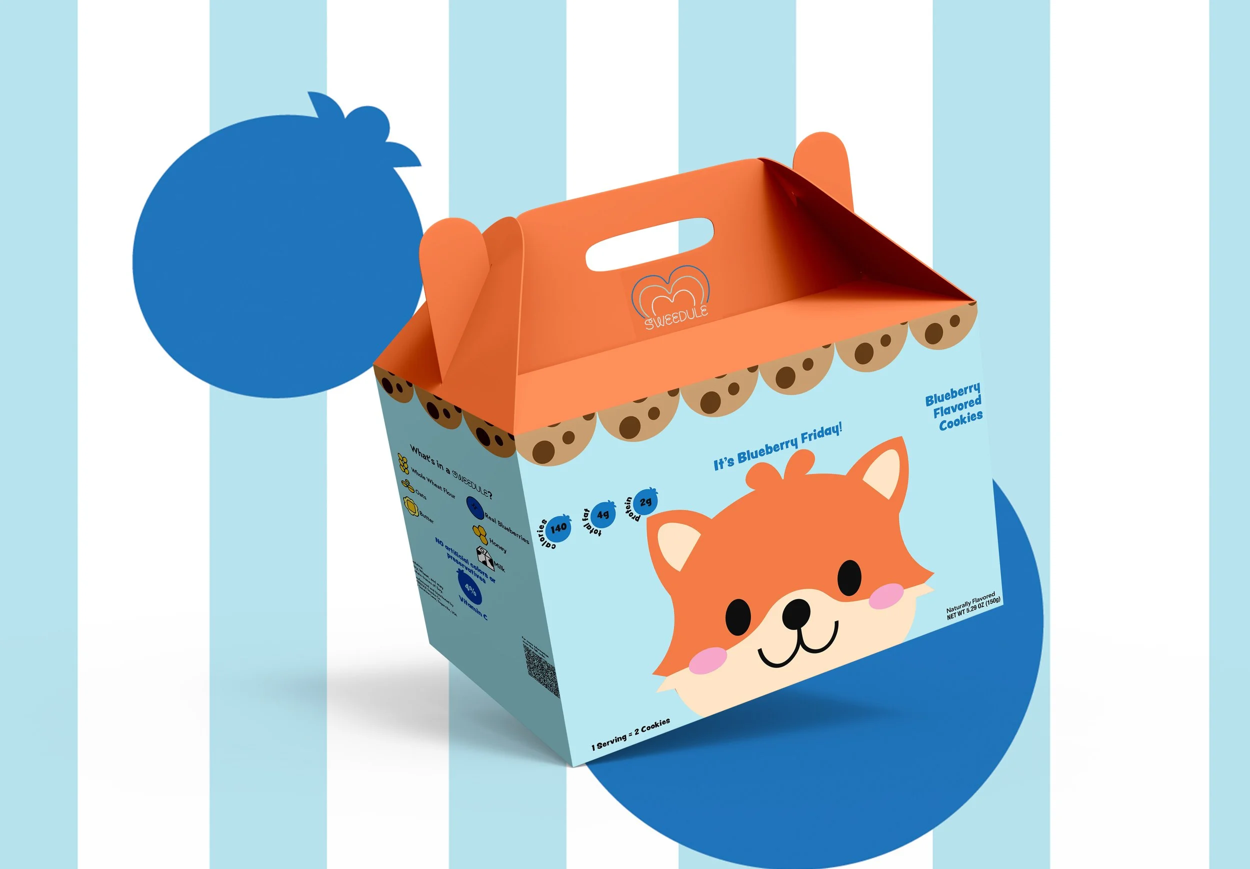
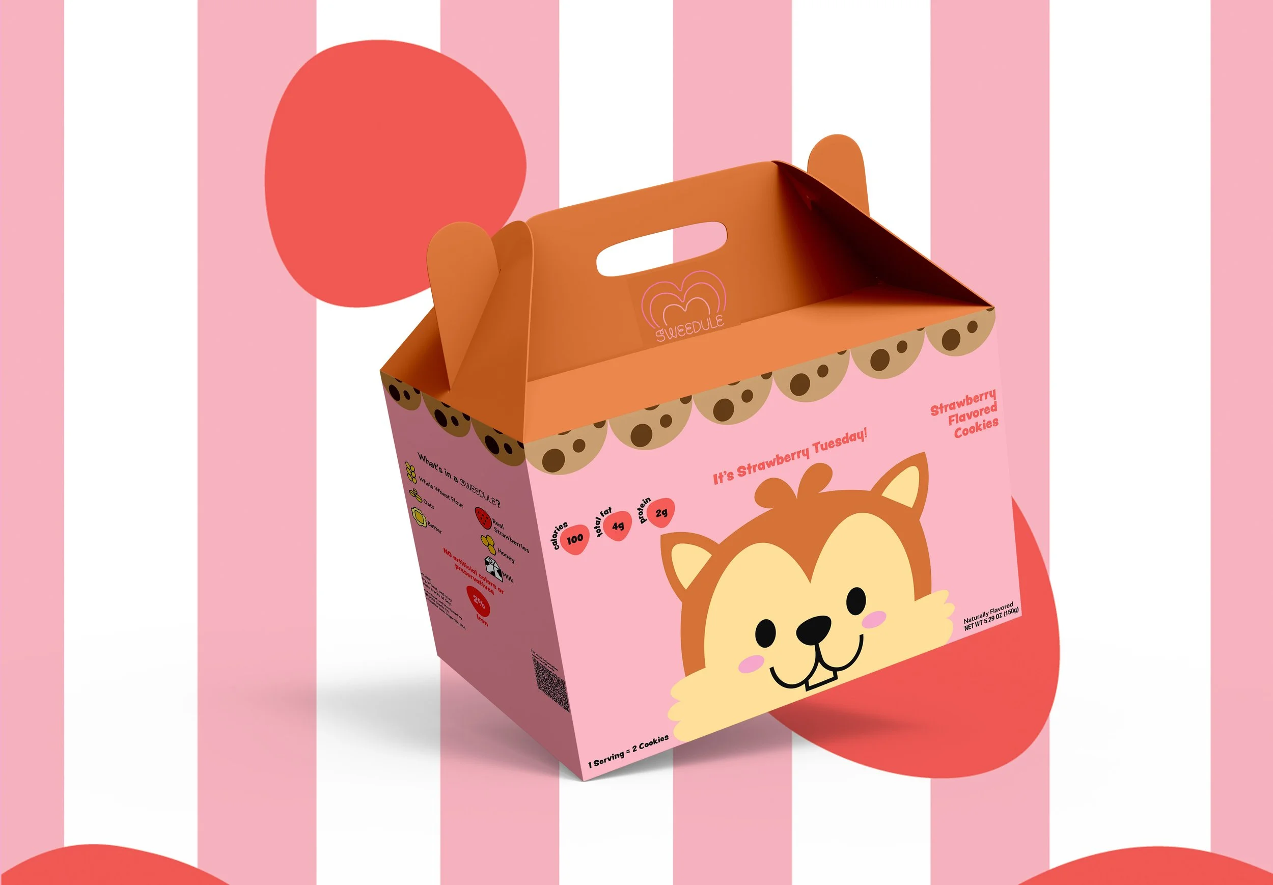
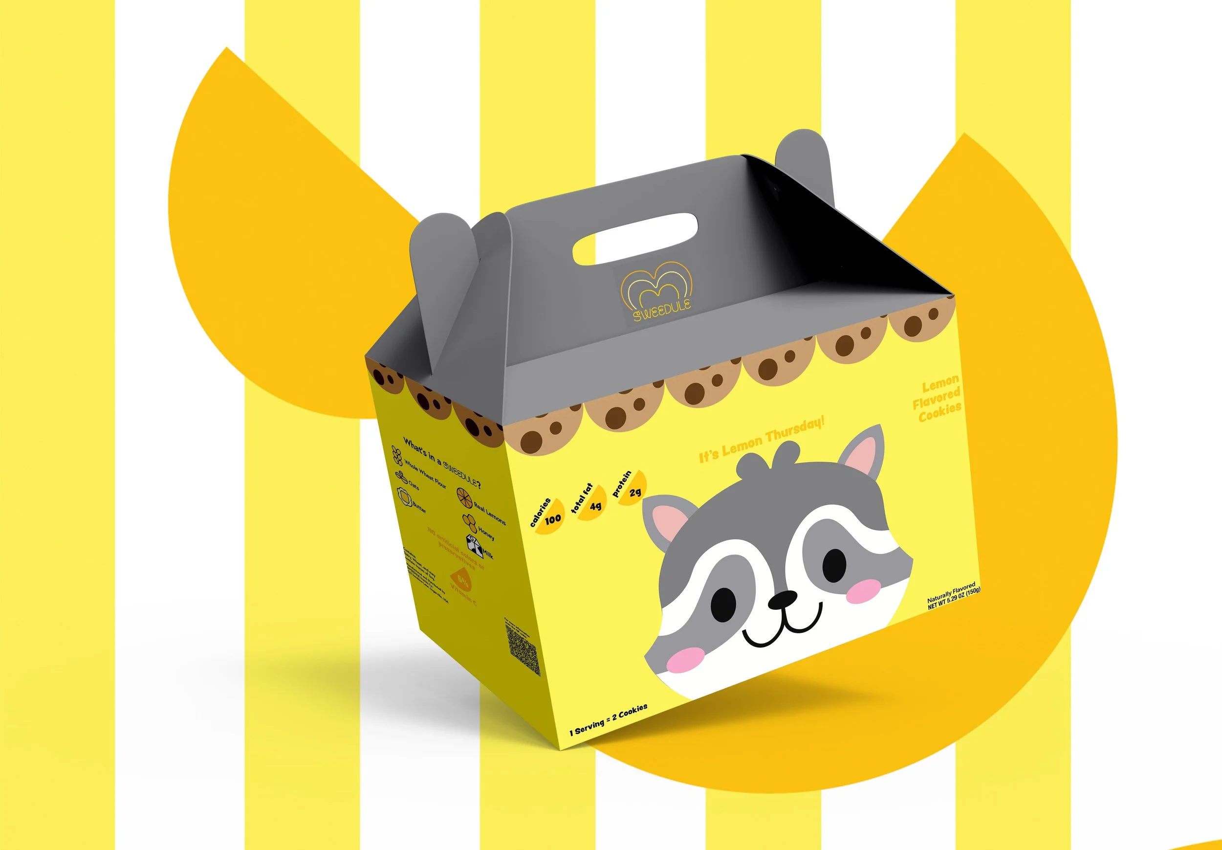
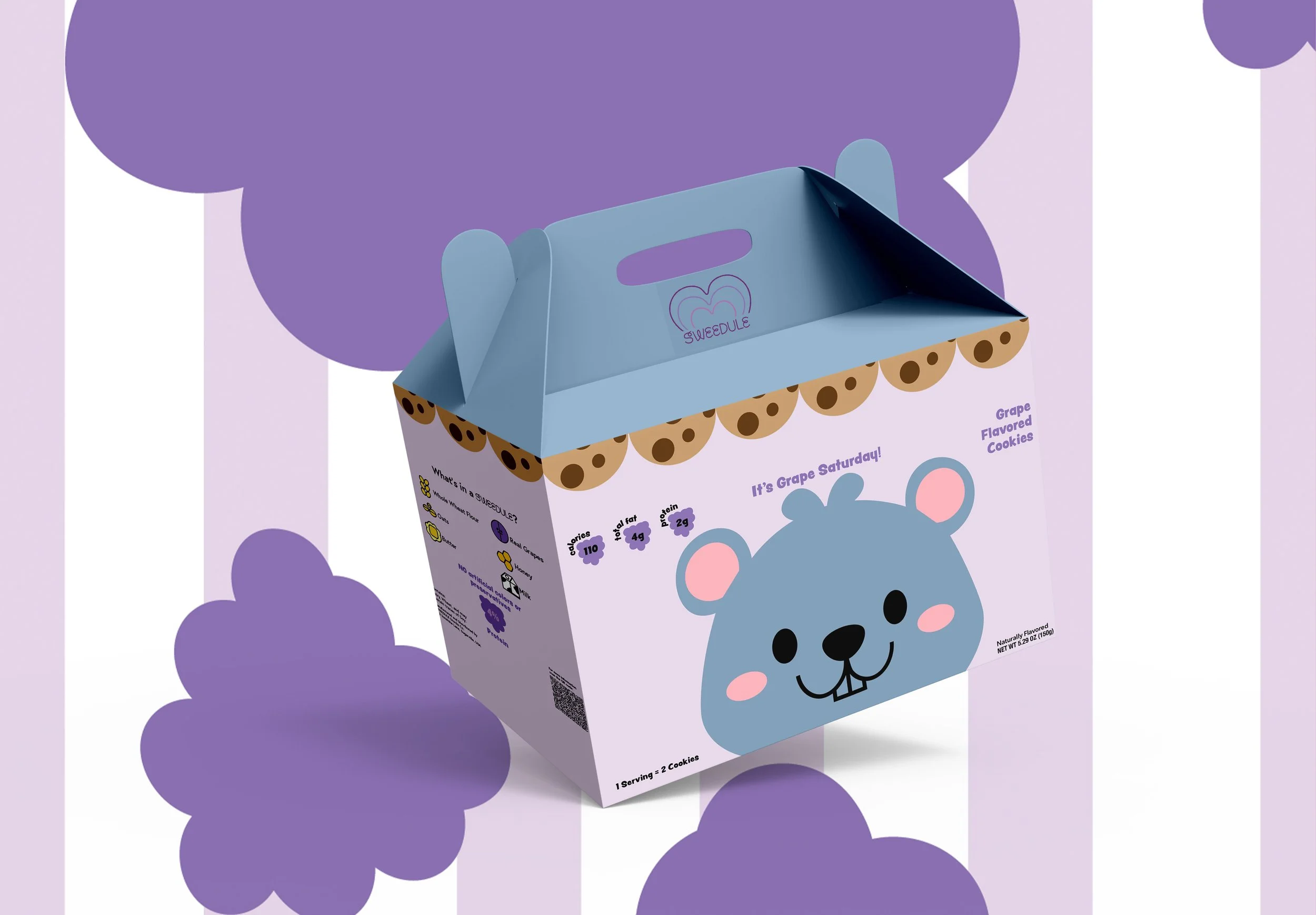
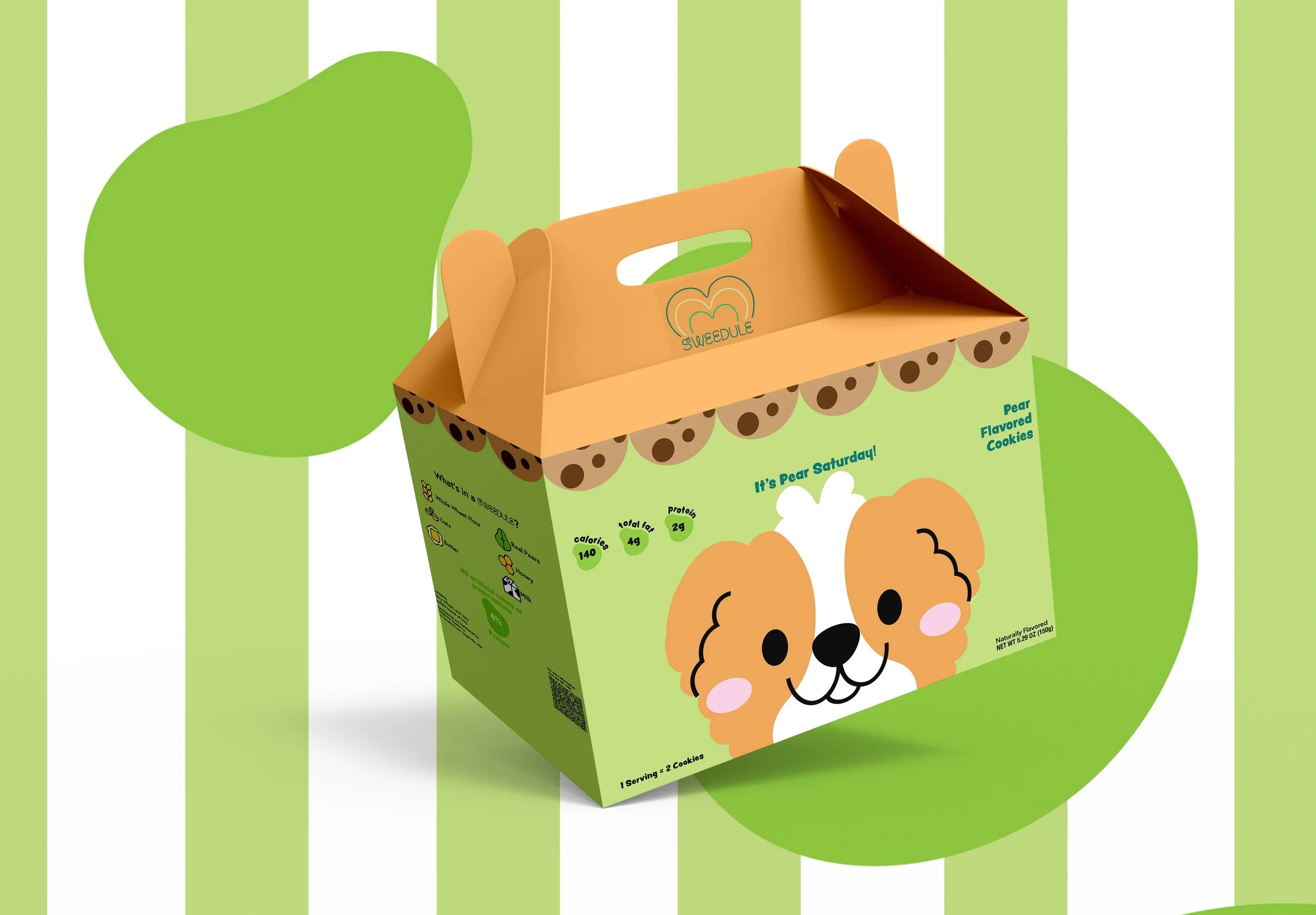
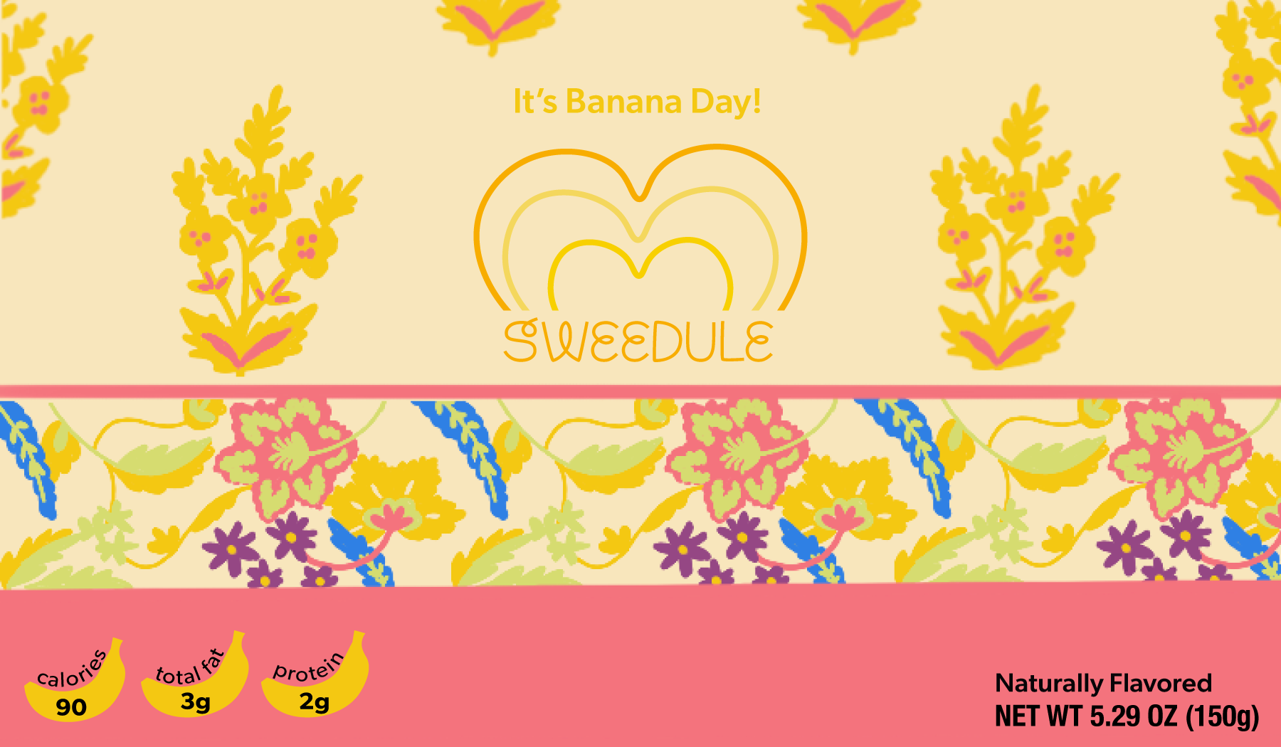
SWEEDULE Cookies
Timeline: 14 weeks
Role: Graphic Designer, Product Designer, Illustrator
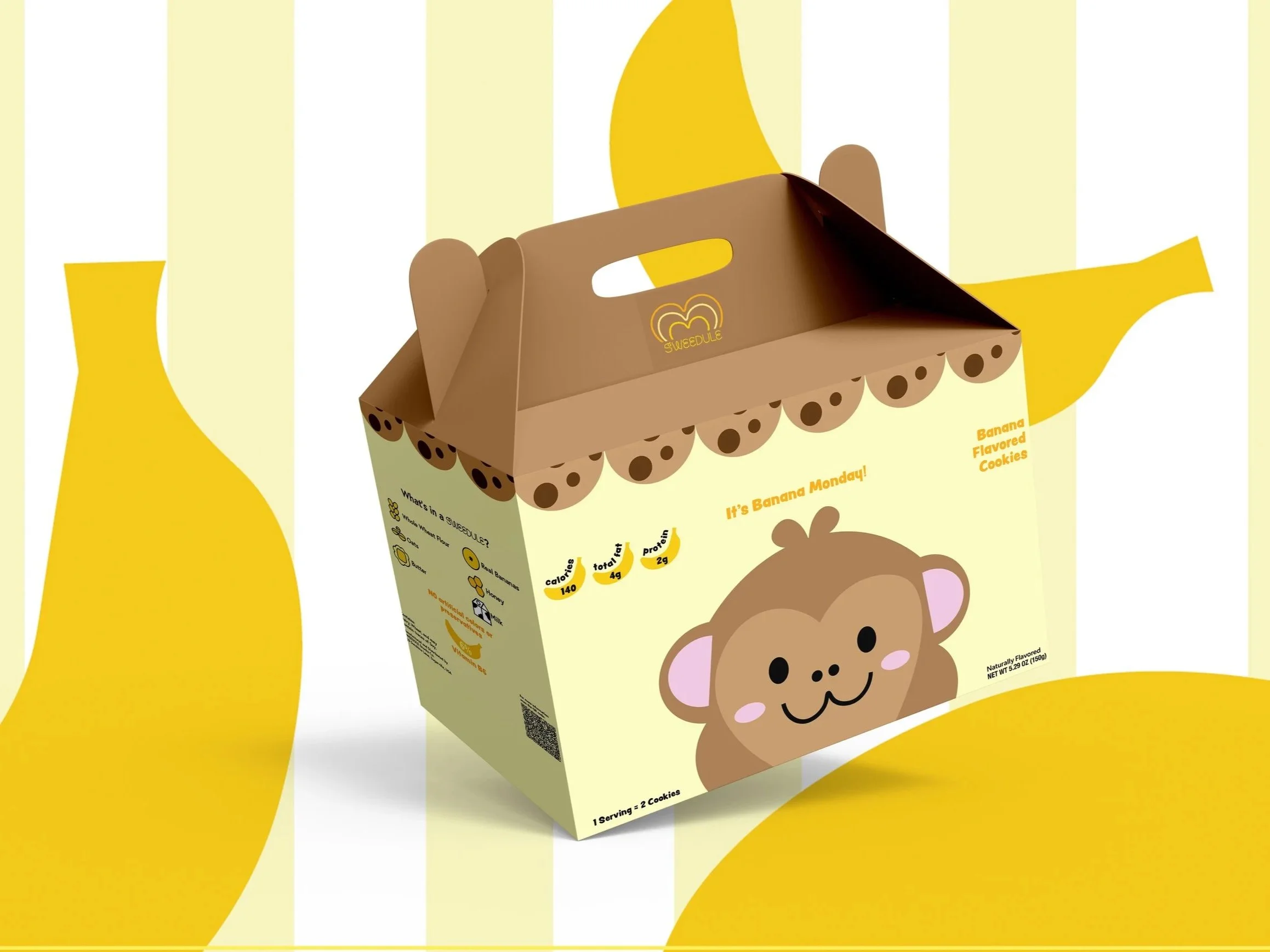
Packaging
Branding
Product Design
This project explores playful and engaging packaging design for a line of cookies, each inspired by a different day of the week. The goal was to create a collectible and fun experience for kids while encouraging a sense of routine and excitement around snack time.
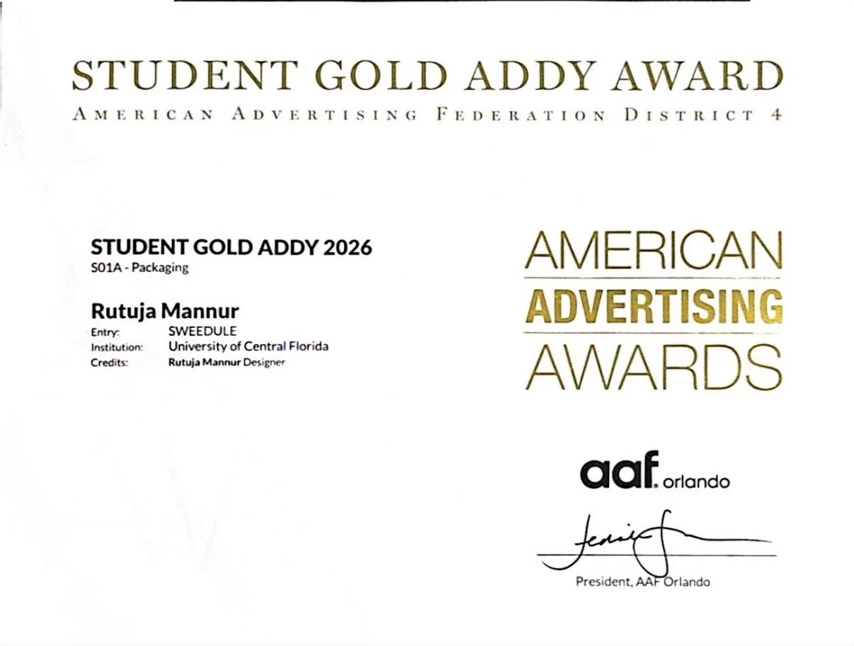
Honors:
Gold Student ADDY Award by American Advertising Federation Orlando for design excellence.
Challenge
Parents often find it challenging to choose snacks for their kids, especially when options are overwhelming or repetitive. They need a quick, intuitive way to decide which treat is suitable for each day without spending too much time thinking.
Approach
SWEEDULE Cookies offers 7 distinct flavors, one for each day of the week, with playful packaging and clear labeling. The design makes it easy for parents to select a cookie while creating a fun, engaging experience for children.
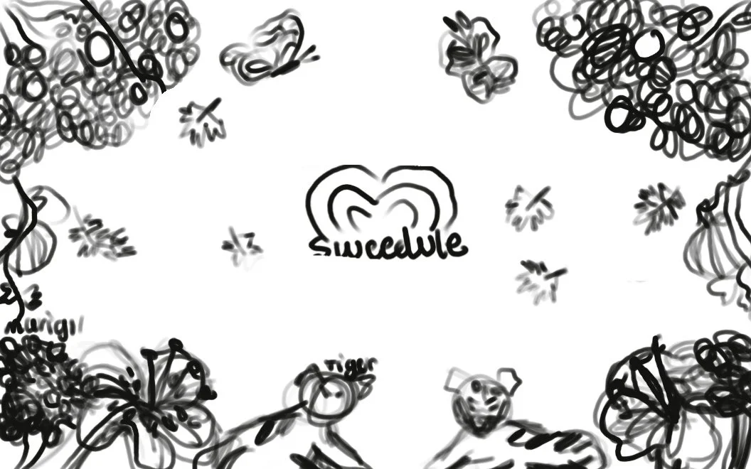
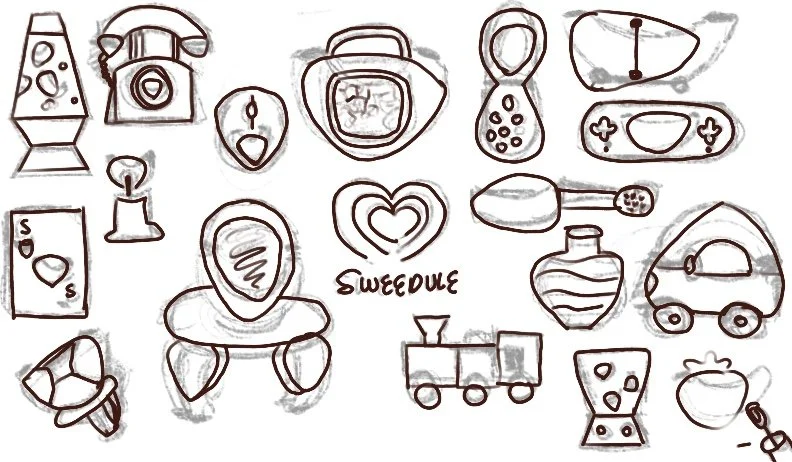
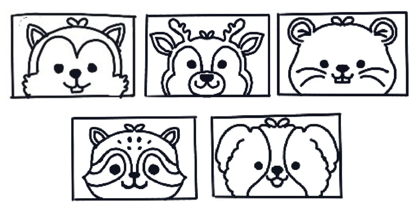
Early Exploration
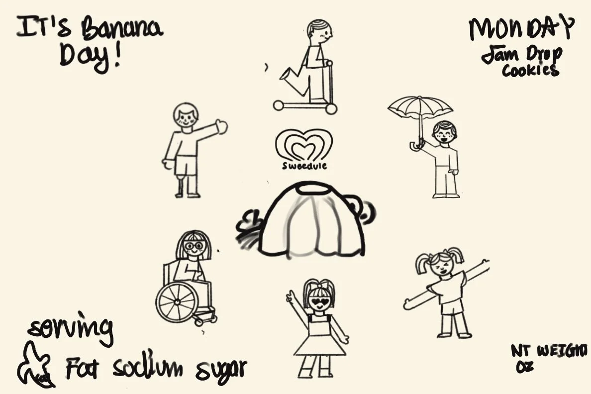
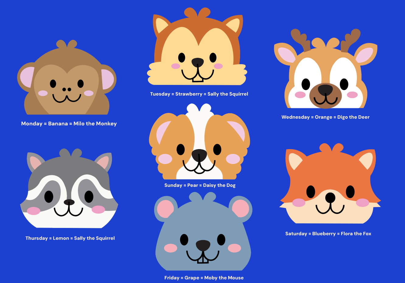
Character Sketches and Final Character Design
Final Logo
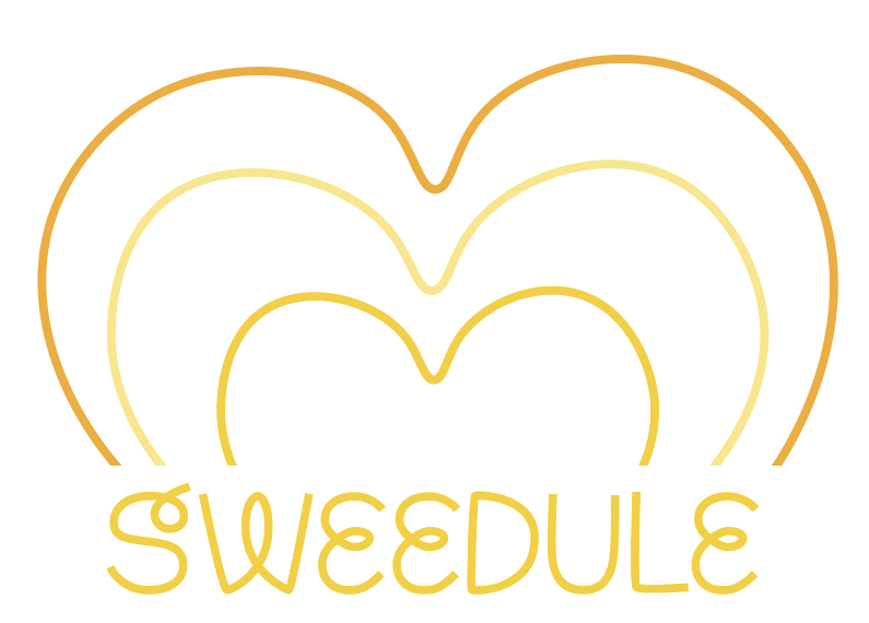

The Sweedule logo is built from three hearts layered within one another to represent how joy and love grow with every cookie. The simple heart form keeps the logo friendly and approachable.
The Sweedule logo adapts across flavors by keeping its core heart form consistent while changing color to reflect each cookie variety.
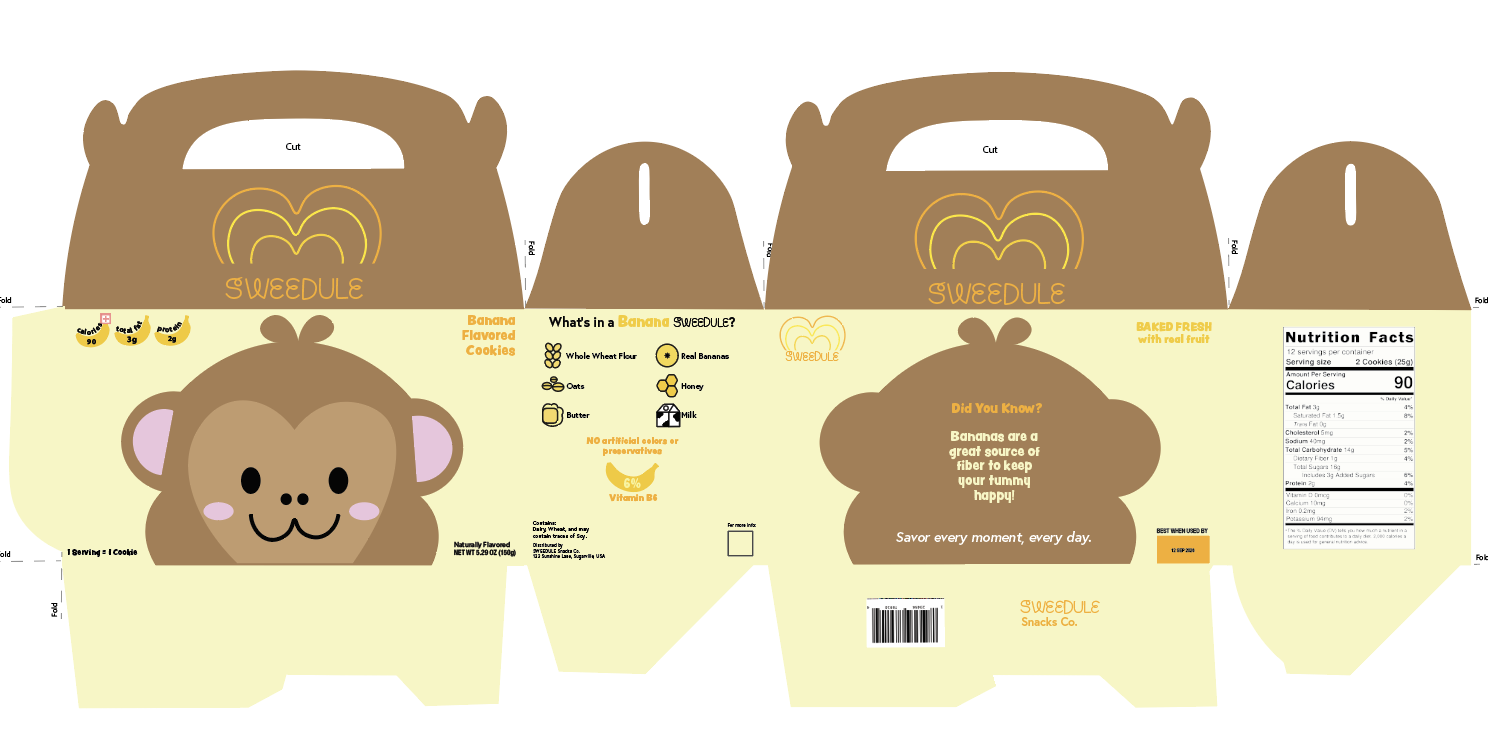
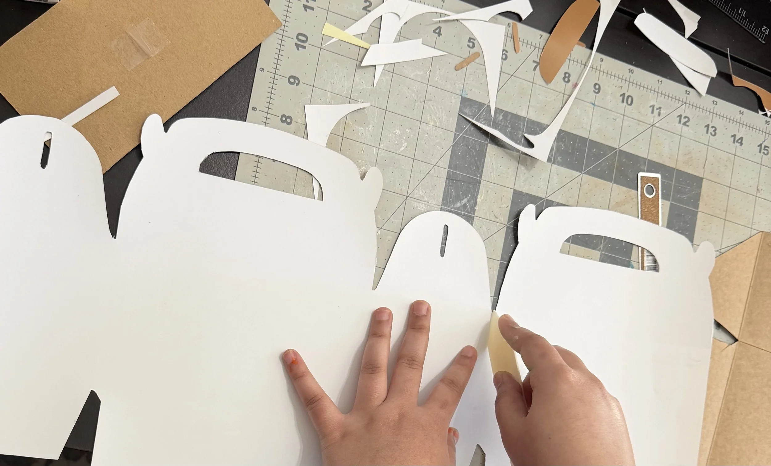
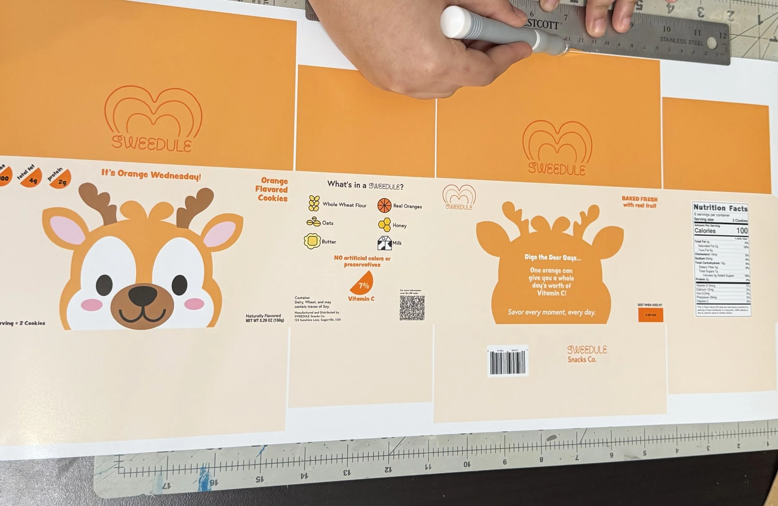
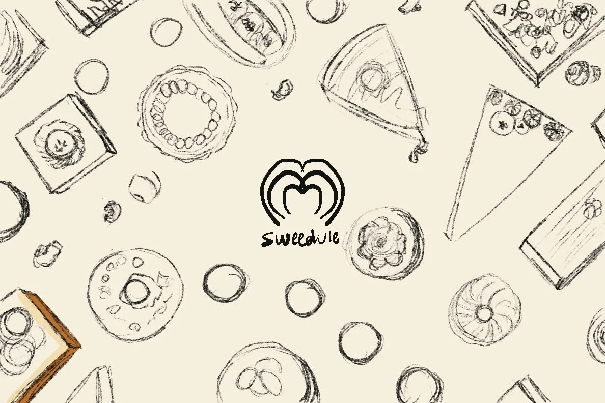
Final Box Dieline and Printing Process