
The Seasonal Table
Timeline: 1 week
Role: Graphic Designer, Environmental Designer, Illustrator
Branding
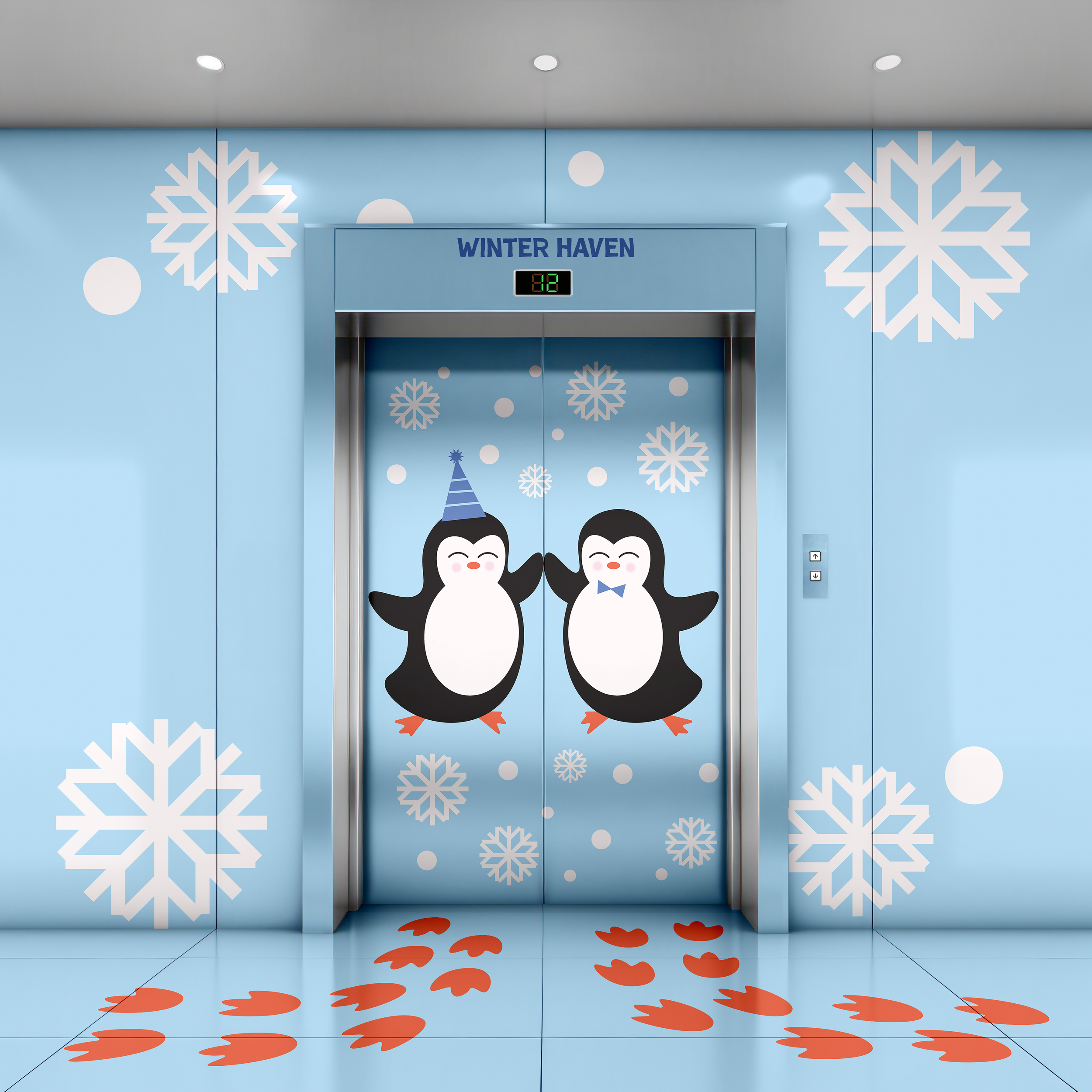
Environmental Design
Seasonal Table is a children’s restaurant concept designed as an immersive seasonal experience rather than just a place to eat. The project explores how environmental graphics, menus, and spatial elements can work together to teach children about seasons and food through design.
Challenge
The goal was to explore how a restaurant experience for children could change visually with the seasons while keeping a clear and consistent structure for families. The focus was on designing two seasonal variations that demonstrate how menus and environmental graphics can adapt to different moods and ingredients
Approach
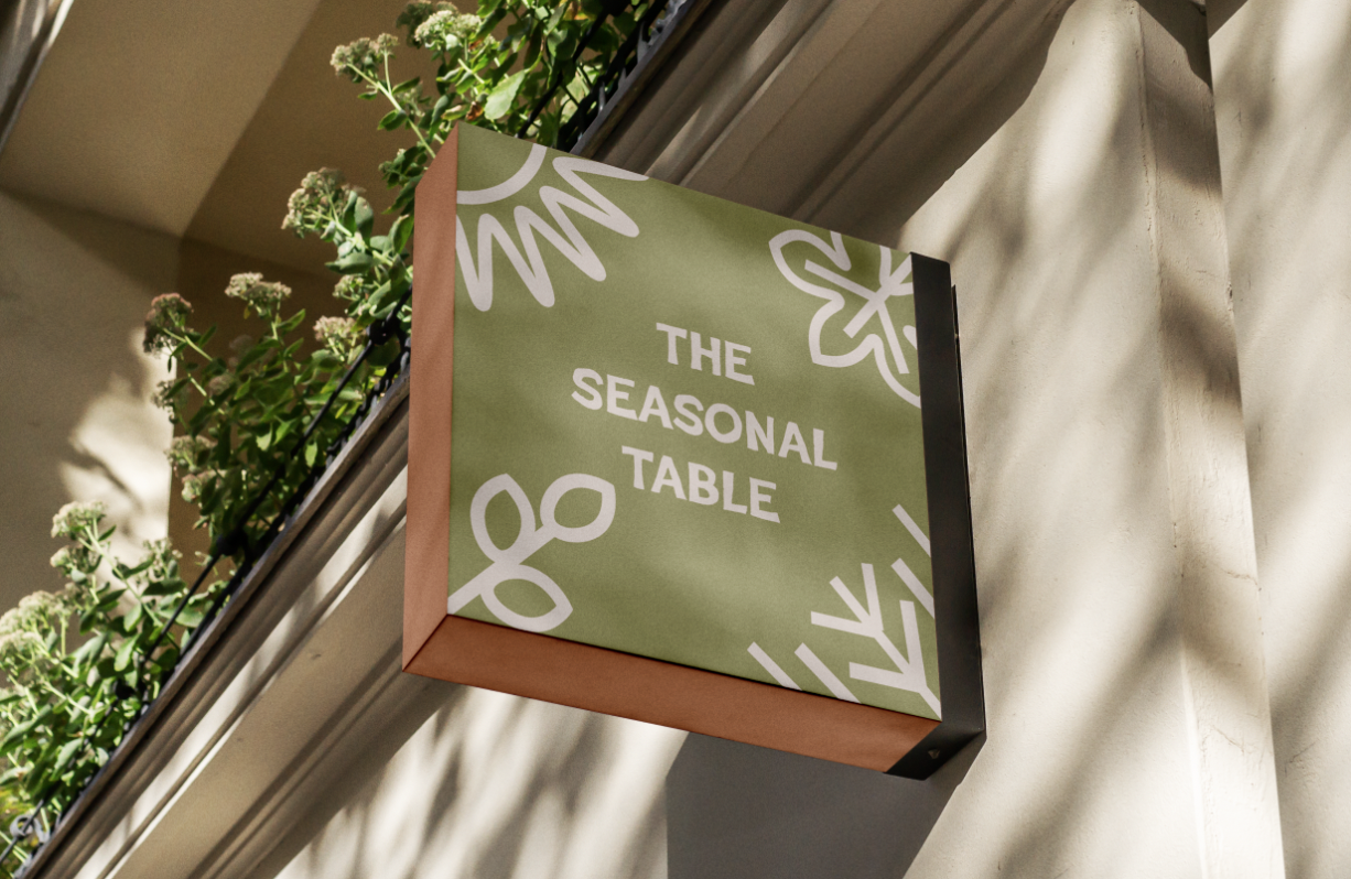
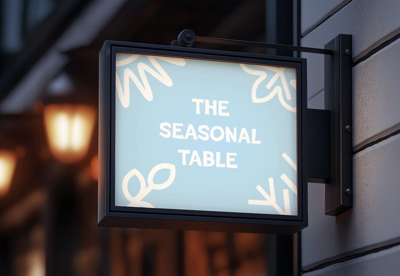
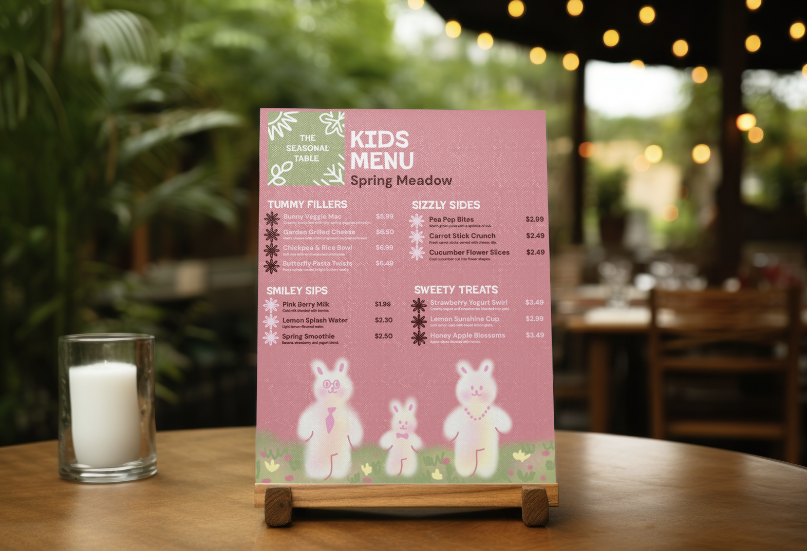
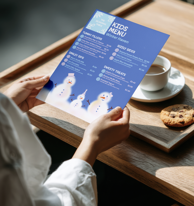
Winter and Spring were selected as contrasting seasons to test the system. Winter focuses on warmth and comfort, while Spring emphasizes freshness and growth. Each season has its own logo, color palette, and menu personality, while still belonging to one restaurant brand.
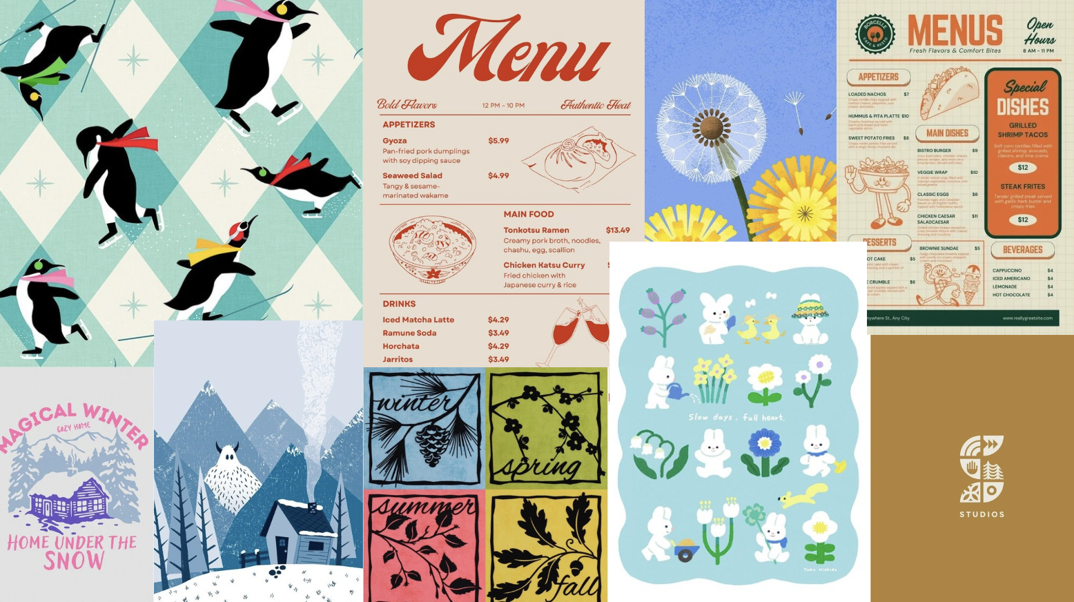
Moodboard
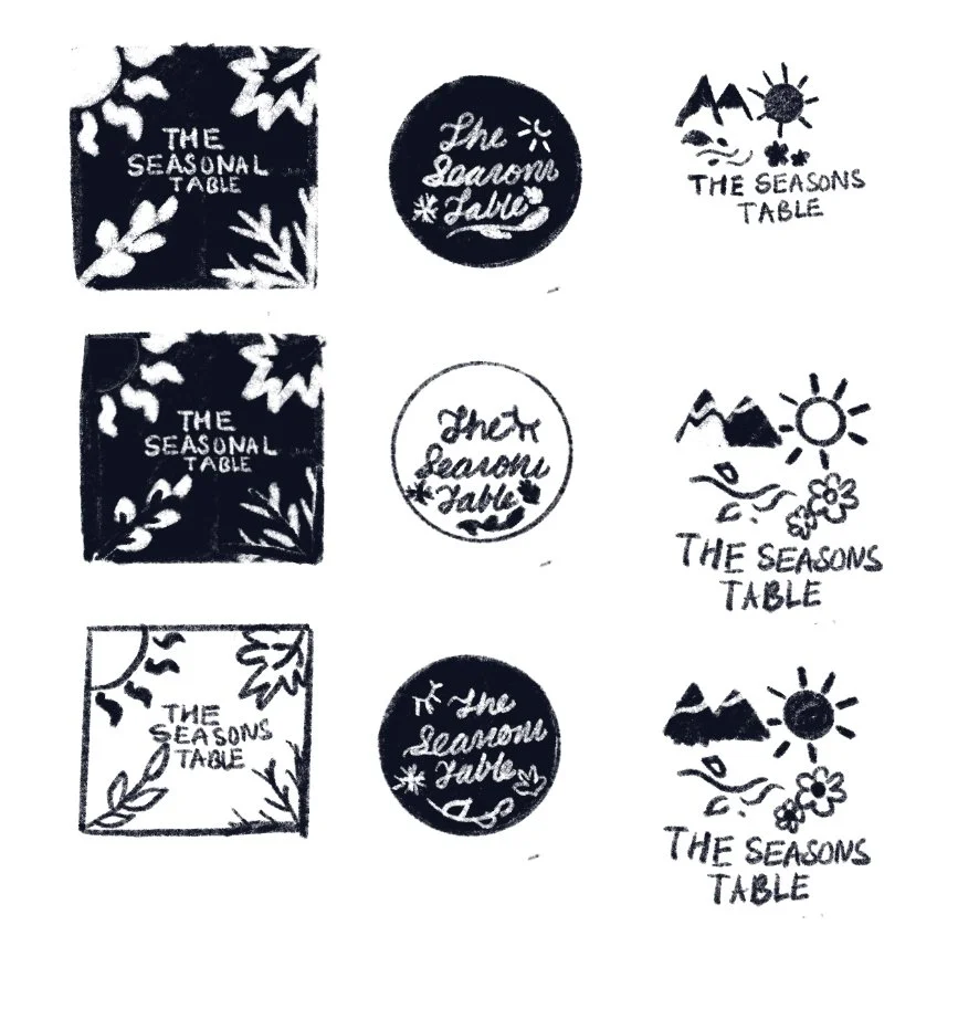
Logo Sketches
Final Logo

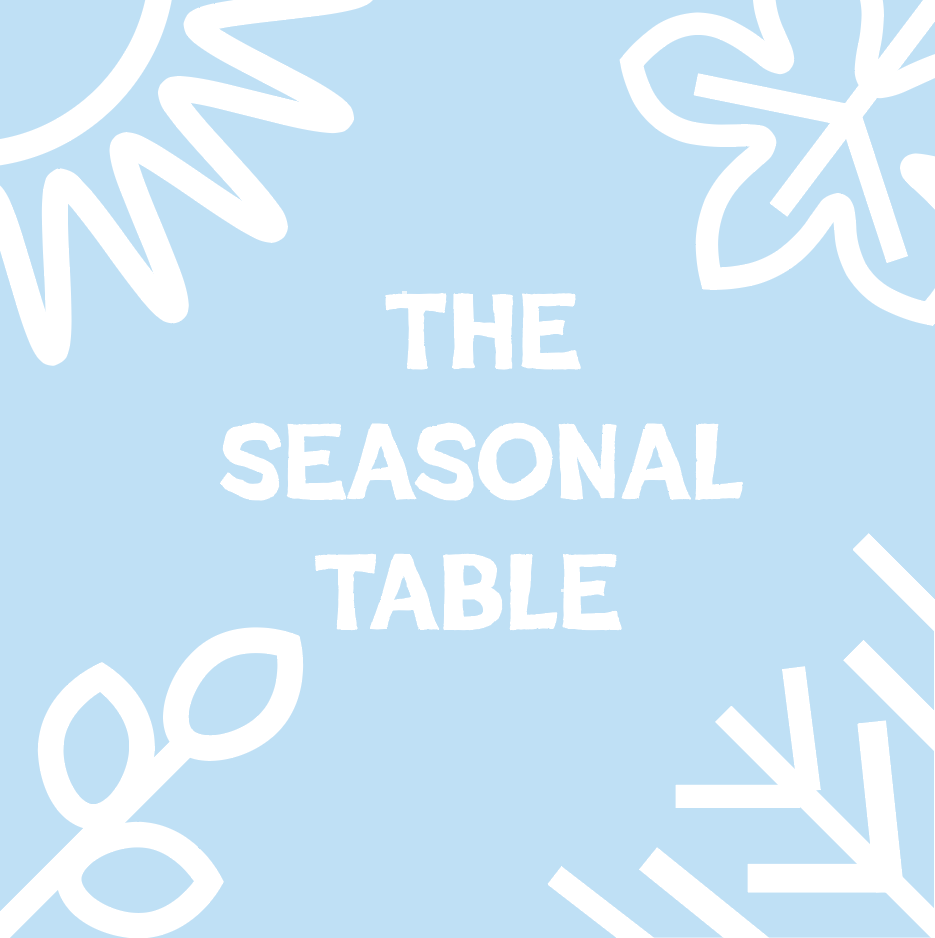
The Winter logo uses soft blue tones to create a calm and cozy feeling. The hand-drawn shapes are inspired by leaves and natural forms, connecting the brand to food and the changing seasons.
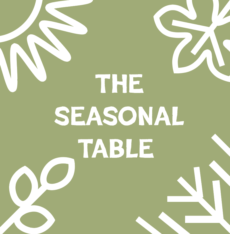
The Spring logo uses fresh green tones to represent growth and renewal. The organic shapes are inspired by plants and ingredients, connecting the brand to nature and seasonal food.
Menu Designs
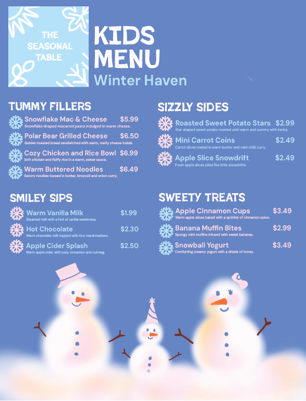
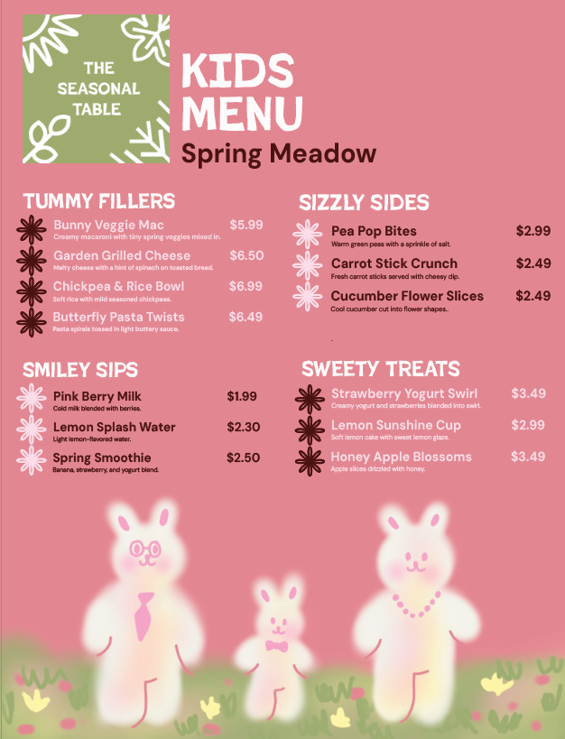
Each menu is visually reflecting its season through color, illustration, and playful naming. Large category titles, simple layouts, and clear pricing make the menus easy for children to read and navigate. Friendly icons and whimsical food names turn ordering into a fun, story-like experience.
Elevator Design